Travel Guide Landing Page
UX/UI Design, Digital Design
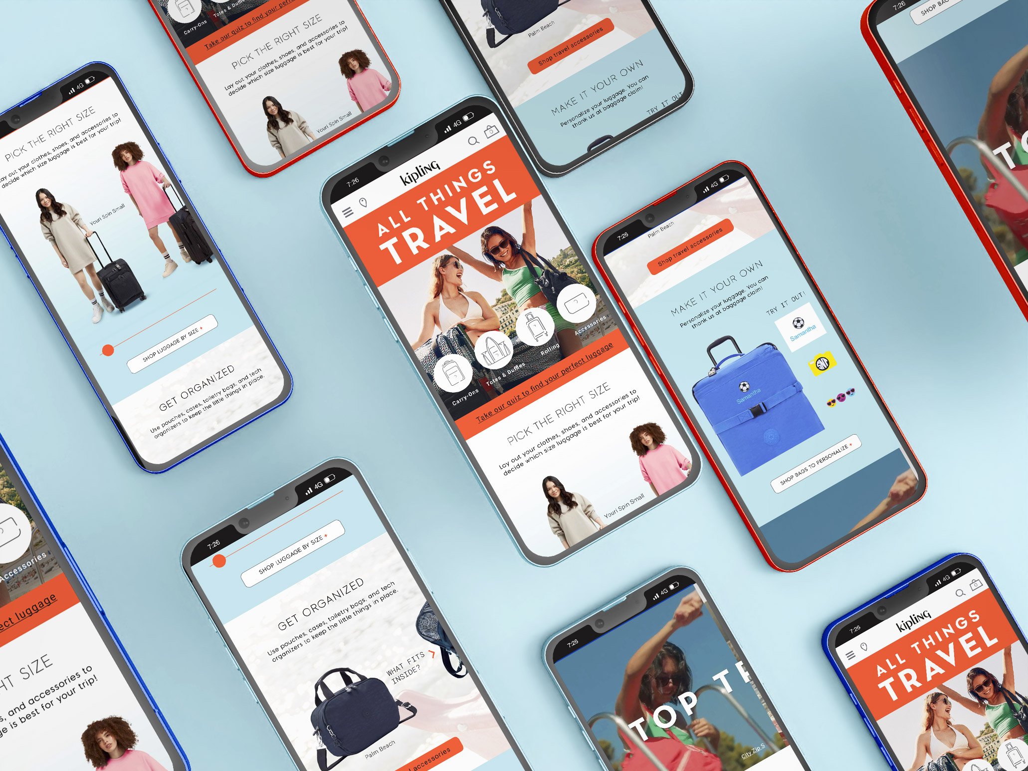
This project aimed to carry over the brand’s bright and minimal aesthetic to the travel guide landing page, while maintaining the focus on product functionality. By prioritizing interactive functions and leading with aspirational lifestyle imagery, I created a landing page that is both fun and informative. Key features include a bright color scheme, a brief quiz to help customers select product, and a deep dive into product function and testing. The end goal is to create a travel-centered sub-environment to service customers travel bag needs.


Heuristic Evaluation
Critical
User Control & Freedom
Minimal ability for users to interact with and fully explore products
Aesthetic and Minimal Design
Copy-heavy layout that limits customer’s ability to view themselves using product
Neutral
Visibility of System Status
Headlines indicate user location on site. Walks user through luggage features and allows comparisons.
Match Between System & Real World
Same naming conventions and featured collections on site as in store.
Positive
Consistency & Standards
Product categories and names align with overall site navigation
Flexibility & Efficiency of Use
Can quickly navigate to categories and most popular products
What We Can Improve
Create an aspirational feel with use of campaign and travel lifestyle imagery
Prioritize user involvement by centering interactive components
Help customers choose product with interactive quiz to narrow down user needs
Utilize social media inspired image scrolls on mobile
Elevate overall look and feel with bright colors and movement
Clean up page by using drop down CTAs
Competitor Analysis
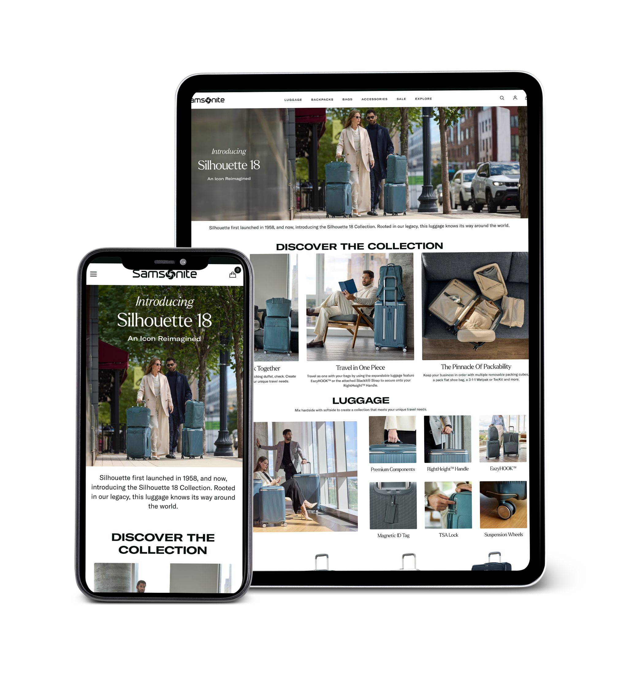
Samsonite
Functionality and collection focused
Marriage of lifestyle imagery and thorough copy
Close-up product images to show product
details
Product endcap for direct shopping from page
Rimowa
Customization focused page to increase TOV
Close up of product features
Enthusiastic copy explains process
Movement engages user
Step-by-step process helps customer along their journey
User Interaction
User interaction was a very important aspect of this project, particularly for the mobile site. The goal was to engage the shopper in a way that mimicked the functionality they would experience if handling the bags in-store. This also provided a personal opportunity as a designer to present my depth of knowledge in animating with Figma. I broke down the page into categories used throughout the site to filter products i.e. size, function, need, capacity, and personalization. This offers users several different avenues to continue their shopping experience. The culmination of the page is the travel quiz which factors in many of the shopper’s needs to filter product just for them, thus creating a very customized experience.
Seasonal Versions
Summer
Fall/Winter
Spring


